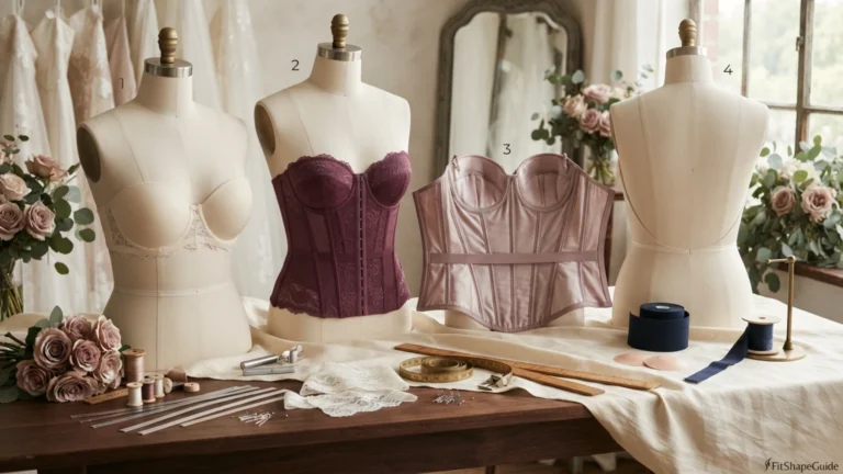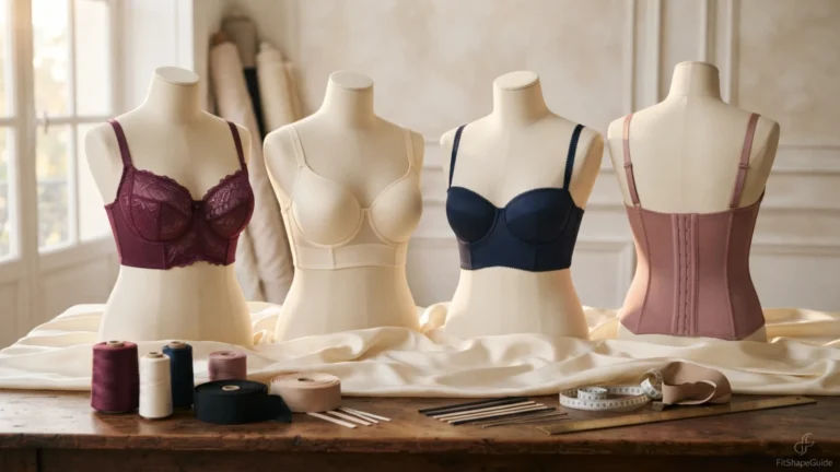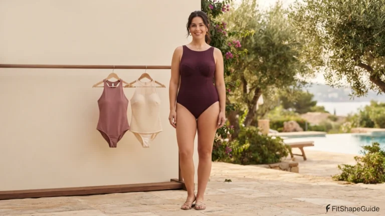
Color Guide for a Large Bust:
What Colors Slim the Chest
Color can guide the eye, but it cannot repair a strained bodice. Learn how tonal dressing, open layers, lower-body emphasis and face-framing color work when the garment already fits.

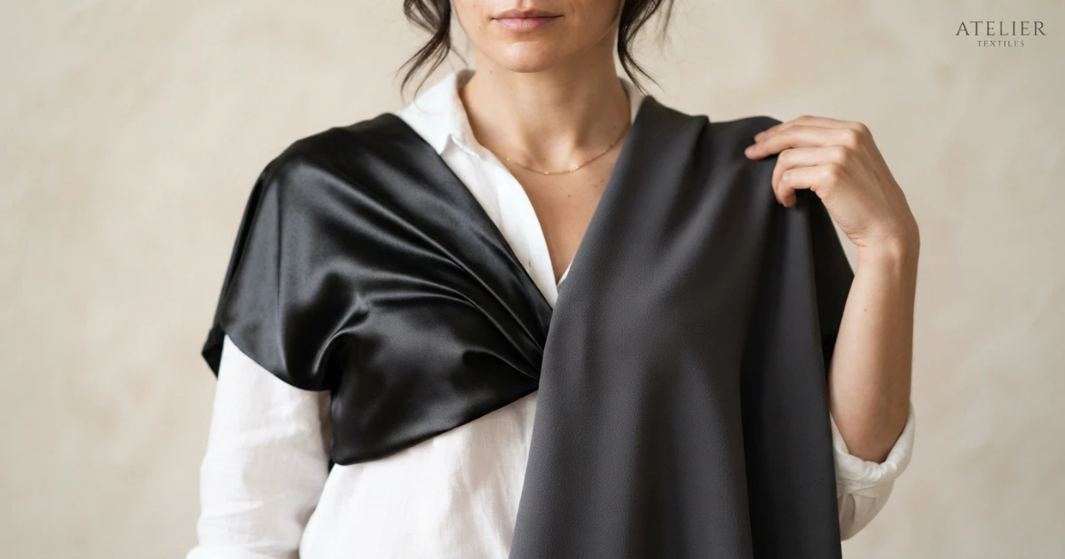
- Use value contrast deliberately rather than defaulting to black.
- Keep the brightest or highest-contrast area away from accidental tension lines.
- Check the outfit in photographs because shine and contrast change on camera.
Color changes emphasis; construction controls the line
“Wear black” survives because it is simple advice, not because it solves every styling problem. A dark garment with a stretched placket, shiny knit or raised front hem still broadcasts tension. A saturated color in stable fabric can look calmer because the eye reads a clean shape before it reads the hue.
Think in terms of value and placement. A darker outer column can frame a lighter center; a brighter trouser or skirt can shift emphasis downward; a face-framing color can keep attention near the eyes. None of these choices requires hiding the body.
The most useful palette is also wearable. Skin tone, climate, laundry habits and the colors already in the wardrobe matter more than a universal slimming chart.
Phone-camera contrast test
Color is a directing tool, not a repair kit. Fix the pulling first, then decide where you want the strongest contrast to sit.
Four ways to place color with intention
These options approach visual emphasis through color and contrast from different construction angles; use phone-camera contrast test to compare seam placement, material and movement instead of trusting the style name.
Tonal dressing
Tonal dressing works when tonal dressing works through low contrast, so the silhouette and fabric finish remain the main visual signals.
Dark open layer over lighter center
Dark open layer over lighter center works when an open layer should create a clean vertical frame without borrowing room from the base garment.
Stronger color on lower body
Stronger color on lower body works when read color together with contrast and shine; a matte bright can look calmer than a dark fabric under tension.
Face-framing color
Face-framing color works when read color together with contrast and shine; a matte bright can look calmer than a dark fabric under tension.
Phone-camera contrast test
Take one full-length photograph in color and one in grayscale. Grayscale reveals value contrast; the color image reveals hue placement. If the chest still dominates in grayscale, the issue is likely silhouette, shine or fit rather than the color itself.
Run phone-camera contrast test once with the garment alone and again with the intended bra or outer layer. Note the first point that changes, because dark color can disguise nothing when seams pull, while a bright color can look beautifully balanced in a well-cut garment. Record whether the change begins when you photograph the outfit from six feet away., compare matte and shiny versions of the same depth of color., or cover the garment color in the photo and inspect seam tension alone.. The earliest failure point in phone-camera contrast test tells you whether to change size, construction, support or styling. Repeat the test after twenty minutes of wear so warmth and movement can affect value contrast, color placement, surface shine and garment fit. Save the result with the brand, size, fabric and bra used; that record makes future decisions about visual emphasis through color and contrast faster and more accurate. During phone-camera contrast test, a change repeated in both passes is construction evidence, while a change appearing only with one layer identifies a compatibility problem.
- Photograph the outfit from six feet away.
- Compare matte and shiny versions of the same depth of color.
- Cover the garment color in the photo and inspect seam tension alone.
Separate hue, value and fabric finish
Use this table with phone-camera contrast test: each row connects a style choice to visible construction evidence and the way it influences value contrast, color placement, surface shine and garment fit.
| Choice | Construction check | Why it helps |
|---|---|---|
| Tonal Dressing | For tonal dressing, tonal dressing works through low contrast, so the silhouette and fabric finish remain the main visual signals. | Tonal Dressing creates a clearer line because its key seams remain aligned during phone-camera contrast test. |
| Dark Open Layer Over Lighter Center | For dark open layer over lighter center, an open layer should create a clean vertical frame without borrowing room from the base garment. | A stable dark open layer over lighter center survives sitting and layering with fewer pins, tape or rescue adjustments. |
| Stronger Color On Lower Body | For stronger color on lower body, read color together with contrast and shine; a matte bright can look calmer than a dark fabric under tension. | Stronger Color On Lower Body becomes easier to repeat when its neckline, waist and hem stay where the pattern intended. |
| Face-Framing Color | For face-framing color, read color together with contrast and shine; a matte bright can look calmer than a dark fabric under tension. | The construction lets face-framing color shape the outfit instead of fighting the bust through movement. |
| Low-Contrast Print | For low-contrast print, check the relevant seam, edge, length and fabric response during phone-camera contrast test. | A well-built low-contrast print reduces the need for compensating camisoles or outer layers. |
| Monochrome Texture | For monochrome texture, check the relevant seam, edge, length and fabric response during phone-camera contrast test. | A stable version of monochrome texture keeps the outfit predictable from the front and side. |
When two options for visual emphasis through color and contrast appear equally attractive, favor the one that passes phone-camera contrast test with fewer support or alteration requirements.
Check contrast from real viewing distances
A still mirror cannot prove that value contrast, color placement, surface shine and garment fit will remain controlled, so complete these checks without smoothing between steps and use phone-camera contrast test as the final reference.
Complete this action without smoothing the garment and use phone-camera contrast test to judge whether dark color can disguise nothing when seams pull, while a bright color can look beautifully balanced in a well-cut garment.
Use a side mirror or phone photograph to find hem lift or bowing, visible signs that dark color can disguise nothing when seams pull, while a bright color can look beautifully balanced in a well-cut garment.
Stand near a window and inspect the side view; transparency or shine can reveal that dark color can disguise nothing when seams pull, while a bright color can look beautifully balanced in a well-cut garment.
Complete this action without smoothing the garment and use phone-camera contrast test to judge whether dark color can disguise nothing when seams pull, while a bright color can look beautifully balanced in a well-cut garment.
Complete this action without smoothing the garment and use phone-camera contrast test to judge whether dark color can disguise nothing when seams pull, while a bright color can look beautifully balanced in a well-cut garment.
Walk, turn and carry a bag without adjusting the garment; repeated rescue suggests that dark color can disguise nothing when seams pull, while a bright color can look beautifully balanced in a well-cut garment.
Classify what phone-camera contrast test revealed: a construction failure, a contained alteration or a personal style preference; return major failures and price small corrections before deciding.
Color advice that creates new problems
The following missteps all confuse the visible symptom with the underlying issue. Each one is better corrected by changing the specific construction detail that affects value contrast, color placement, surface shine and garment fit.
Using black to excuse poor fit
Using black to excuse poor fit is a problem when dark color cannot hide a stretched placket, raised hem or shiny tension line; Correct the construction before judging the palette.
Hard color blocks at the bust
Hard color blocks at the bust is a problem when a hard horizontal break across the fullest point creates emphasis exactly where the colors meet; Move the contrast line or soften the value difference.
High-shine high-contrast fabric
High-shine high-contrast fabric is a problem when a hard horizontal break across the fullest point creates emphasis exactly where the colors meet; Move the contrast line or soften the value difference.
Abandoning favorite colors
Abandoning favorite colors is a problem when giving up a color you enjoy solves nothing if the replacement garment still fits poorly; Change placement, value or fabric finish instead.
For visual emphasis through color and contrast, correct the first displaced landmark—edge, seam, closure, waist or hem—then repeat phone-camera contrast test before adding another styling device.
Shine can reverse the effect of a dark color
For visual emphasis through color and contrast, the support layer changes projection and width, but it cannot supply missing fabric; test the final bra before judging value contrast, color placement, surface shine and garment fit.
Tailoring is worthwhile only when the bust and shoulder are comfortable and the remaining issue is local enough to preserve visual emphasis through color and contrast.
Color formulas that preserve a clean line
These combinations show how visual emphasis through color and contrast can change mood and formality while keeping the underlying construction decisions intact.
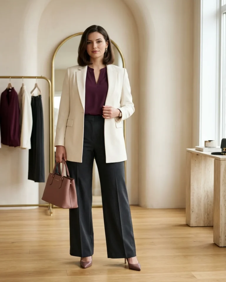
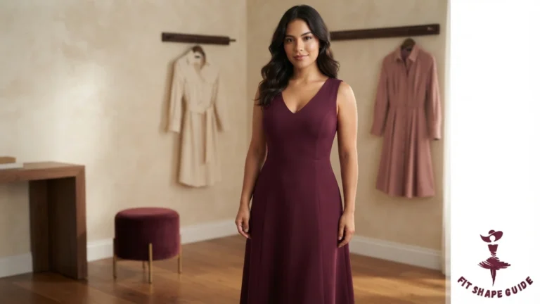
Deep plum blouse
Wear the deep plum blouse with a clean-waist trouser or skirt and an optional open layer; the deep plum blouse needs enough front ease for its placket or neckline to remain flat when seated.
Neutral V top
Use the neutral v top as a low-bulk base with a stable trouser, skirt or open layer; for this neutral v top, choose opacity and recovery before deciding how close the fit should be.
Cream scoop shell
Use the cream scoop shell as a low-bulk base with a stable trouser, skirt or open layer; for this cream scoop shell, choose opacity and recovery before deciding how close the fit should be.
Bright split-neck blouse
Wear the bright split-neck blouse with a clean-waist trouser or skirt and an optional open layer; the bright split-neck blouse needs enough front ease for its placket or neckline to remain flat when seated.
Compare product color beyond the studio image
For visual emphasis through color and contrast, compare online measurements with a successful garment you already own instead of relying on the size name.
Save the reference piece’s front length, shoulder width, armhole depth and fabric composition because those landmarks predict value contrast, color placement, surface shine and garment fit.
Study side and back photographs for evidence that dark color can disguise nothing when seams pull, while a bright color can look beautifully balanced in a well-cut garment is being hidden by front-only styling.
Prioritize reviews that discuss bust room, recovery, bra coverage and landmark placement relevant to phone-camera contrast test.
Before ordering for visual emphasis through color and contrast, confirm the return window and decide what level of alteration would still make the finished garment worthwhile.
Adjust contrast for daylight, work and events
Adjust the strategy to the setting by checking whether value contrast, color placement, surface shine and garment fit remain functional for the hours, movement and visual expectations involved.
Everyday wear
For everyday visual emphasis through color and contrast, choose pieces that survive sitting, carrying a bag and laundering without tape or repeated adjustment.
Work and polished settings
In polished settings, value contrast, color placement, surface shine and garment fit should remain controlled through a full seated day rather than only during a mirror check.
Events and photographs
For events and photographs, test the exact bra, lighting and outer layer because dark color can disguise nothing when seams pull, while a bright color can look beautifully balanced in a well-cut garment becomes clearer from side angles and flash.
Seasonal layering
In seasonal layering, preserve visual emphasis through color and contrast by adding warmth without crowding the same neckline, armhole or waist area.
Keep the color or question the garment?
Keep the garment when it manages value contrast, color placement, surface shine and garment fit through phone-camera contrast test and works with your real support layer and care routine.
Consider alteration when visual emphasis through color and contrast is structurally sound and the remaining problem is contained to a dart, waist, strap, sleeve, button or hem.
Return it when dark color can disguise nothing when seams pull, while a bright color can look beautifully balanced in a well-cut garment remains after the correct size, bra and simple styling adjustments have been tested.
Record brand, size, fabric and front length from the successful phone-camera contrast test so the next purchase begins with evidence.
Wear the palette that supports the silhouette
The strongest result for visual emphasis through color and contrast is comfortable, deliberate and easy to repeat rather than overloaded with universal rules.
Use phone-camera contrast test, side views and real wear to create personal guidance that is more accurate than a generic shape chart.
Frequently asked questions
Practical answers for the decisions that usually appear after the first try-on.
What is the main rule for colors that slim a large bust?+
Darker matte colors can reduce emphasis, but tonal dressing, vertical color framing and moving strong contrast away from the chest are more flexible strategies.
Do I need to avoid using black to excuse poor fit completely?+
No. The concern is the way using black to excuse poor fit affects fit or proportion. A modified cut, better fabric or different placement can change the result.
Which option is the safest starting point?+
Tonal Dressing is a practical starting point, but it still needs adequate bust room, stable construction and compatibility with your support layer.
Can tailoring improve the result?+
Yes, when the shoulders and bust already have enough room. Waist shaping, sleeve shortening, hidden closures and seam refinement are usually more predictable than adding significant fabric.
How should I judge the outfit in the fitting room?+
Check it standing, sitting, reaching and from the side. Look for level hems, stable necklines, straight seams and freedom from repeated adjustment.
Does color determine whether this works?+
Color can direct attention, but it cannot correct pulling, poor front length or unstable construction. Fit, fabric and line come first.
Related guides
Move to the next connected fit decision instead of starting from zero.
Fit first. Style always.
Keep the garment that remains stable, comfortable and recognizably yours after the complete movement test.